The Best and Worst of Arcade Cabinets
18 Designs That Either Wow or Fail to Impress
Happy pride month! It's been a while since an update has been posted, so I put together some photos to browse through. Inevitably, the ”best of“ and ”worst of“ lists will appear; doesn't matter too much what you're talking about, nearly anything that's popular and been around a while will have good and bad examples of the product and someone will rank and stack a few of them into some sort of order that's hardly scientific and reflects not much more than the personal taste(s) of whomever assembled said list. Well, I can hardly resist this temptation myself and now present to you some of the best and worst arcade cabinet designs! This list reflects just my personal preferences; it's not based on any research or polls to represent the gaming community at large, and as such I'm sure some readers will disagree with my selections. It's also incomplete; with so many games out there, narrowing down to just a handful is tough! There's some really great (and bad!) cabinets out there which I had to leave out just to prevent this article from rambling on forever. That said, I like pointing out some of the cabinets out there just in case there's some you haven't seen before...especially on the good list, there's some fantastic artwork and design that went into presenting arcade games that's worth checking out. A great cabinet couldn't make a bad game good, of course, and if a cabinet was so poorly designed that it hindered gameplay in some way that could be a problem. But it's still nice to take a look at the artwork and creativity some designers had and if a game was already good a fantastic cabinet certainly helped make the game just a little bit better of an experience. So without further delay, let's take a look at our entries!
The Best Arcade Cabinets
First up, some of the best cabinets; click on any of the photos below if you wisth to see a larger version of the photo, and/or visit the game entries for more information and when possible more photos.
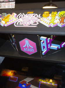
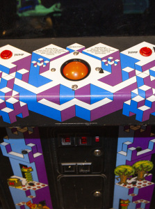
Crystal Castles
Let's start off with Crystal Castles; released by Atari in 1983, the design is absolutely perfect for the game! The overall cabinet shape is similar to other Atari games of the era such as Millipede and Star Wars and features a similarly slanted marquee and monitor/speaker locations. The entire cabinet is covered with outstanding artwork reminiscent of M.C. Escher; more than most cabinets, no space is left alone! The overall shapes combined with the artwork provide a geometric visual that matches nicely with the game's graphics. An illuminated trackball and the angled and illuminated speaker grills provide some nice finishing touches. Conversion kits for Missile Command or other standard Atari cabinets such as Centipede were available and while they looked great, none matched the grandeur of the dedicated cabinet.
Computer Space
Being released in 1971, Computer Space is the first commercially available arcade game. As such, there was definitely no precedent to follow when designing the cabinets for it. And yes, that's cabinets, plural; the game was available in both single player and two player versions as well as in different colors (including some with glitter). Instead of wood as would become common, Computer Space uses fiberglass allowing for round edges and curves in the shape giving it an impressive sci-fi-esque appearance. There really is no other cabinet since that compared.
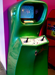
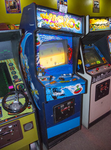
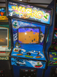
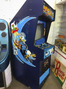
Wacko
One of the most unusual cabinets out there is Wacko; in some respects it has similar style and proportions as a typical cabinet, but the first thing you'll likely notice is the slanted marquee and control panel. I don't believe any game has ever done such a thing and this certainly makes Wacko stand out! Fantastic alien artwork rounds out the presentation for this unusual but fun game.
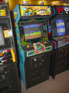
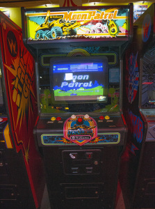
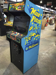
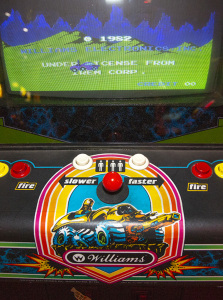
Moon Patrol and similar Williams cabinets
Williams Electronics had some great cabinets; they were overall similar in size and shape but with minor tweaks and varying artwork between games. They just have an overall well balanced, attractive appearance to them with creative artwork. Of the lot, Moon Patrol is one of my favorites. The side art is a stenciled yellow and dark blue over a light blue featuring our famous moon buggy blasting some aliens along with the game and company logos. The front features an incredible, detailed marquee with our moon buggy again while the monitor bezel features an artistic rendition of the city level background scenery. Overall classic presentation for a brilliant game!
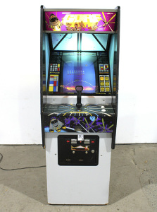
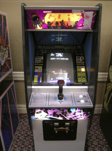
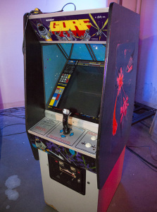
Gorf
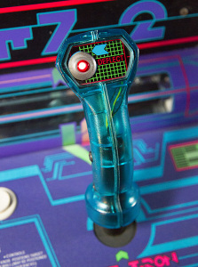
Gorf takes the Galaxian-style space shooter and expands the concept by offering five unique levels, each with a variation on the theme. It then adds in an impressive-looking spaceship-styled cabinet designed to mimic being at the controls of a sci-fi spacecraft. Some extra lights illuminate the panel just below the controls along with a “window” above the monitor. Possible rankings display to the right of the monitor with your current ranking being backlit. The red grid pattern in the joystick itself also lights up. This last feature is virtually impossible to see today; the small, incandescent bulbs are soldered onto a small board making them far too difficult to replace. Being incandescent and not LED, the original bulbs are almost definitely burned out after a few decades of use and most owners/operators of Gorf machines likely haven't gone through the extreme trouble to replace them. Oh well. Despite this problem, however, Gorf is an impressive looking game that's also fun to play.
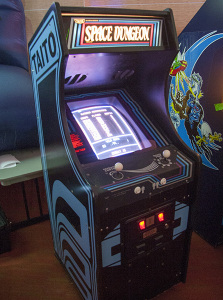
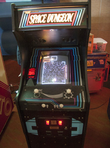
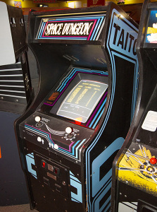
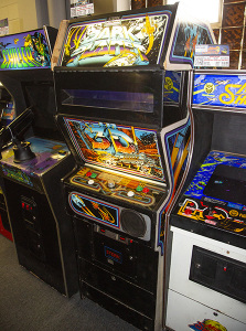
Space Dungeon and similar Taito cabinets
Space Dungeon and other Taito cabinets from that era all look very similar; a little shorter than most, the artwork is actually somewhat generic with just the Taito logo and geometric patterns on the side. The marquees do feature unique logos from game to game, but the design pattern is similar with the game title against a (usually) black background outlined by several slanted rectangles. Artwork on the monitor bezel and control panel does vary from game to game but usually follows a similarly geometric, almost generic appearance. In some cases the instruction card is backlit, although these days it's not uncommon for the owner/operator to not bother replacing this bulb if it's out. It might seem unusual that cabinets so seemingly generic might make a best of list, but I always thought the Taito cabinets looked quite sharp. Colors varied from game to game, the artwork is minimalistic yet stylish, the marquees are usually lit with incandescent lamps instead of the more common flourescent used at the time, the overall cabinet size and shape looks quite nice, and the overall package both allows for both unique elements while providing a strong and consistent Taito brand image. I chose Space Dungeon as a pretty typical representation, but also check out Alpine Ski, Jungle Hunt, Elevator Action, or Front Line for some other nice examples.
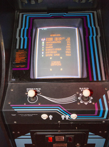
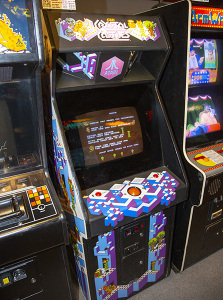
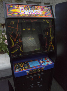
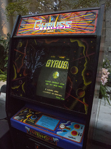
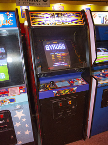
Gyruss
The first thing you'll notice about Gyruss is the stunning, vibrant abstract shapes on the side that make the cabinet stand out quite well from it's peers. The overall cabinet shape isn't much different from other Centuri cabinets, but it does have some unique changes to it. The monitor is brought further forward than typical; in fact, the controls are essentially indented underneath it with the speakers right above the player's hands as well. The marquee follows the abstract theme and gives the impression of warping into space Star Wars style with the monitor bezel and control panel featuring more detailed space artwork. Gyruss was a fairly unique game for the time and the cabinet matches it nicely! Conversion kits for the game were available, but as one might expect they never matched the style of the original dedicated cabinet.
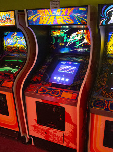
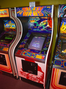
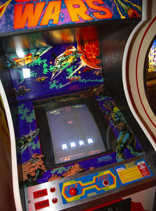
Galaxy Wars and similar Universal cabinets
Universal's typical cabinets in some respects resembled Taito's with a similarly short height and curved profile. They did, however, utilize some impressive, almost psychedelic artwork for most of their games! A unique feature in the Universal cabinets is the illuminated panel just above the monitor; each game had unique artwork here to complement the monitor bezel, control panel, and sometimes front panel. The sides were most often a more generic Universal logo stencil, although some games also had unique artwork. Overall the vibrant artwork is what makes them stand out, and Galaxy Wars is a particularly good example. See also Lady Bug, Cosmic Alien, Cheeky Mouse, Magical Spot, Zero Hour, and Cosmic Avenger for some other great examples. One minor drawback for some games, however, is the speaker location; for some reason it's at the bottom of the cabinet pointed at your feet! Despite that oddity Universal made some great looking games.
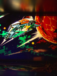
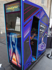
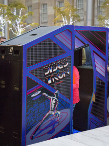
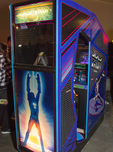
Discs of TRON
While this list isn't in any particular order, I did leave the best for last; the greatest arcade cabinet of all time is without a doubt the environmental version of Discs of TRON! Weighing in at over 730 lbs, this cabinet is an impressive and brilliant creation. Following in the steps of the original TRON, it uses multiple black lights to illuminate UV reactive artwork pretty much everywhere that gives an impressive impression of the movie's special effects. A two-way mirror also provides a detailed backdrop for a 3D effect that makes the game appear to be floating over the TRON landscape (this effect, as with any game that uses a monitor backdrop doesn't photograph well and needs to be seen in person). The joystick is made of a UV reactive blue plastic that appears to light brightly as well. An unusual feature for the time is the sound; two speakers in front and two behind provide stereo surround sound that just wasn't found in other games of the era. Also unusual for an environmental cabinet was that it had players standing rather than sitting; you can lean against the back though, making it comfortable to play. A window with a grid allows spectators to see through the upper part of the back wall as well. Striking artwork adorns the sides and for a final touch, the marquee is of the 3D lenticular variety. Due to the size, finding these today is tough; if you can manage to, it's an experience not to be missed! There are also two varieties of standard cabinets as well; one is the intended upright cabinet and also features the lenticular marquee; even this one looks quite impressive. The second was created from unsold environmental cabinet inventory; the cabinets were essentially sawed in half at the factory to create one resembling a standard cabinet. This is my least favorite due to the lack of the lenticular marquee (or indeed a lighted marquee), but it still looks great and all three offer the same, fun gameplay. Due to the unusual controls (especially the push/pull spinner), this one is hard to emulate and can really only be experienced in person with any one of these three versions. If you'd like to see more, also check out the YouTube video Environmental Discs of Tron Video Tour for a closer look at the game both inside and out.
The Worst Arcade Cabinets
Things don't always go well...Sometimes corners are cut to save on costs, practical concerns are deemed more important than aesthetics, or a designer's ideas just didn't work that well. Whatever the reason, here's a few cabinets now that just didn't look all that great!
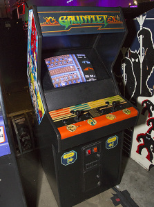
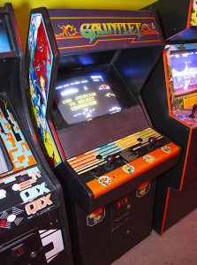
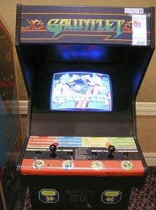
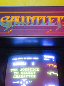
Gauntlet (2 player)
The two player versions of Gauntlet and Gauntlet II along with Rolling Thunder (and maybe others) came from the era came in cabinets that represented one of the not-so-good designs Atari came up with. For starters, the marquee doesn't light up! Right off the bat this makes it less attractive than its competitors. The speakers in these cabinets are right by the control panel (not all that different than the System 1 cabinets). What does strike me as odd is the speaker panel angle is very slightly different than that of the monitor. Had the difference been either greater or the same, it would have looked better; to me, the slight difference looks more like a mistake than intentional although I'm sure it's not. The cabinet is a little shorter than typical and as a tall person I found the monitor situated far back enough and the marquee is forward just enough to slightly get in the way. Gottlieb cabinets are similarly short, but I don't have the same problem with them. Somehow the screen position and angle along with the marquee position just causes a very slight obstruction. If I had to guess, these cabinets were designed to be practical and not necessarily the best looking; a smaller factor is lighter and easier to ship or move, and no marquee light is one less part to install in the warehouse and for operators to maintain. Perhaps it's not really one of the worst out there, and is the best looking of those on this worst list; the artwork does overall mirror the 4 player cabinet version. But maybe it's because Atari's earlier cabinet designs were so good that this one just comes across to me as the result of cost cutting and is a disappointment after those earlier efforts.
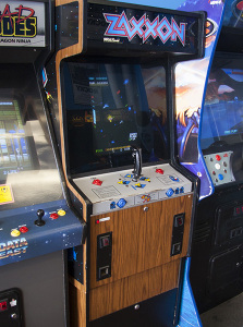
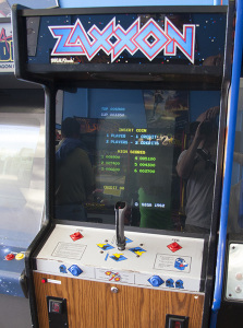
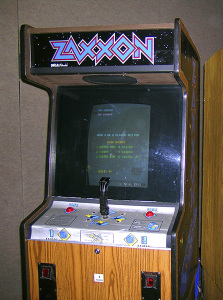
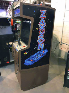
Zaxxon
Zaxxon and other similar SEGA cabinets from the era are about as artistic as a refrigerator. They are on the taller end and incredibly boxy. The fake wood grain (or painted brown as some SEGA cabinets had) gives them a decidely 70's/80's appearance that hasn't aged well and SEGA's artwork always seemed to be functional but not particularly attractive. Aesthetically, I always thought they looked top heavy; I don't think they actually are, but the design just doesn't have a nice visual balance. Really, these were designed to be practical systems — operators could purchase SEGA kits (or even those from other manufacturers) to quickly convert the cabinet into a new game. Unfortunately SEGA put a lot of effort into that concept but apparently not much into appearance (or, so it seems).
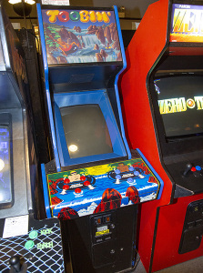
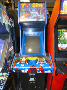
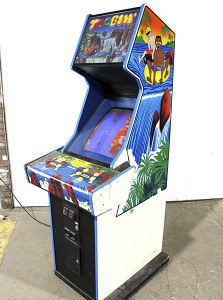
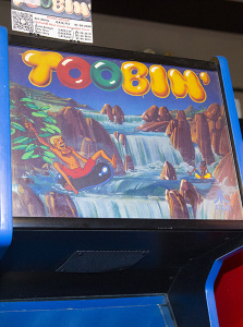
Toobin'
The Toobin' cabinet could use a hamburger or two! Seriously it's quite skinny...the control panel is pretty standard width, but the rest of the cabinet is incredibly narrow. The game uses a vertical orientation for the monitor and features a similarly narrow but taller than usual marquee. It overall makes things look as if they've been squished. I'm not sure if this was an attempt to reduce weight or simply to make the game stand out visually, but I've always put this one into the list of late-Atari designs that just don't work well. The skinny proportions just look ridiculous to me.
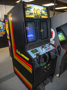
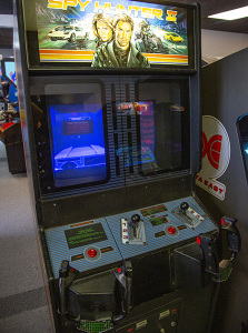
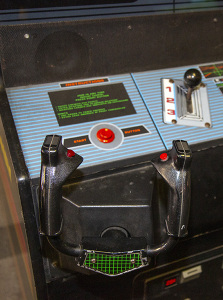
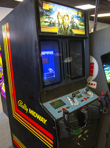
Spy Hunter II
The original Spy Hunter is an arcade classic! The outstanding gameplay, stylish cabinet, impressive graphics and sound, and it's fun, spy concept made for an excellent package everyone loved. Unfortunately, Bally/Midway followed it up with an awful design (and that is for both the gameplay and the cabinet)! The most immediatly noticable change is that the game is now two-player (probably jumping on the multi-player trend that tried to get more quarters at a time for a single game). It does this in an unusual fashion, though, and features a single monitor that is split in two by the bezel. This just doesn't provide a particularly good view for either player and makes the screen appear to be small and narrow (even more so than would be typical of a vertically oriented arcade game). Given the poor resolution of games at the time, it also essentially provides less detail visually since each player has only half of the screen. Due to the curvature of monitors at the time, this split also has the side effect of making the screen for each player appear as if it's sideways a bit; the left player has the screen apparently facing left and the right player the inverse. This alone isn't a deal breaker, but does make the display look odd. The gameplay is not nearly as good as the original, and the very large, clunky cabinet with it's poorly implemented split screen make this one to skip. The game wasn't particularly popular, so even finding one today can be tough.
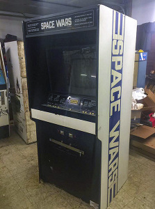
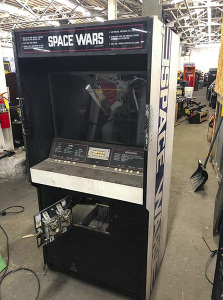
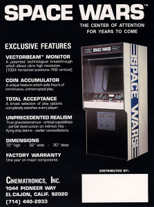
Space Wars
Another boxy, refrigerator design. Released in 1977, you could possibly forgive it for not having the best artwork (or really, any artwork), but what really makes that cabinet annoying is the tiny, non arcade-like buttons used. This isn't just an aesthetic issue, but makes gameplay annoying as well! But appearance-wise, it's just bland; no color, no real artwork beyond the stylized logo, and no real well thought out design to the overall cabinet shape. A truly missed opportunity for a space game, especially in an era where artwork was often used to convey what computer graphics technology was unable to.
Mappy
Another unusual Bally/Midway creation; the first thing to stand out is the MARQUEE!!! Geez, it is huge and disproportionate from the rest of the cabinet. You're certainly not in danger of missing the game and game title I suppose, so maybe it's a success from that perspective. But it just looks bolted on to a cabinet style Bally/Midway had used before without much thought. And that's a recurring theme for designs I don't like; from a practicality point of view, having parts that are literally bolted on and assembled on location are fine, but ideally it shouldn't look like it. If something looks bolted on but isn't, that's even worse, but in Mappy's case I believe the marquee does indeed easily disassemble. Anyway, artwork isn't bad, but isn't anything special either. You'll also find some Jr. Pac-Man's that look like this too; in fact, they were indeed originally Mappy cabinets that were converted to Jr. Pac-Man at the factory due to Mappy not selling well. They look equally rediculous.
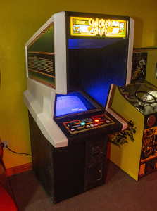
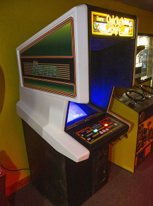
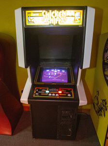
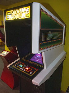
Chicken Shift and other Bally Sente SAC-1 cabinets
The Sente Game System was designed from the ground up to make converting games easier; the cabinet was generic and allowed the marquee, control panel, and game boards to be easily swapped. This approach was becoming more and more popular as operators ran out of room to store dedicated cabinets pulled off the arcade floor, and this was Sente's attempt to woo operators looking to streamline their operation. Taking a look, this cabinet design's most prominent feature is how large it is, particularly the the huge, plastic hood at the top of the cabinet. The idea seemed to be to create a more “immersive” experience by allowing the player to have his or her head inside the cabinet to block light and sound from the environment. That concept works reasonably well (nothing ever blocks all light and sounds, of course), but unfortunately the plain, generic appearance isn't very attractive. Sente did have other (smaller) cabinet styles for sale; at 32" wide, 37" deep and weighing an impressive 375 lbs, the SAC-1 cabinets wouldn't fit through the door of many locations so either wider doors or a loading dock of some sort would be necessary! It was incredibly simple to switch games with this cabinet compared with other systems on the market, so they did a great job from a practical points of view, but I never liked the large, hulk-like appearance with the plastic “immersion” portion looking like it was bolted on to a different, smaller wooden cabinet bottom. It's also unfortunate they didn't make game specific decals for the sides. While it may not look great, I do have to give it credit for being a fairly unique design, and their intentions were in the right place. Some earlier games, such as Tunnel Hunt, featured a similar concept but weren't quite as large and unwieldy. But whether you find the SAC-1 ugly or attractive, it's definitely a sight to behold!
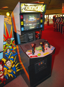
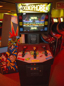
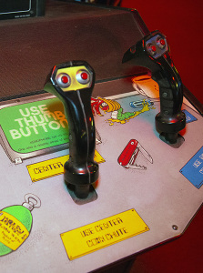
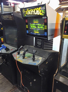
Xenophobe
Xenophobe, at first glance, isn't completely different from some other Bally Midway games of the era (see Rampage, for instance), but in this case there's a disconnect. The top and bottom of the cabinet are virtually seperated and it looks as if the monitor is mounted on a stand instead of part of the whole thing. Perhapse due to the decals, it also looks robotic in a Wall-E sort of fashion; you could half expect the monitor to swivel and look around. Perhaps that was intentional...but the overall concept has never been a personal preference; I get more the impression of unrelated parts bolted together than overall cohesive design. Could just be me, probably not everyone will agree with that. At first I thought designs like this might have been inspired by a goal of reducing weight making it cheaper to manufacture or ship, but as Xenophobe weighs just over 300 lbs that doesn't seem likely to be the case.
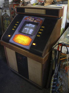
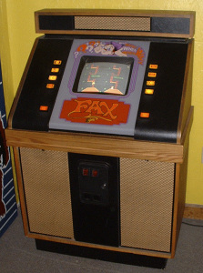
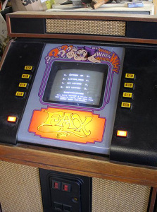
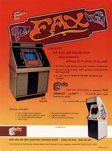
Fax
I don't have any Exidy cabinets in my best of list, but usually their efforts looked pretty good. And then there's Fax...wow, just wow. The style is quite different from pretty much any arcade cabinet and was apparently designed to more closely resemble a jukebox (a rather dated looking 70's jukebox, that is). And I do think that was the intent; as a trivia game Exidy may have well thought bars, restaurants, and similar locations were more likely to purchase the game than your average arcade. And, given the trivia, card games, and simple puzzle games often seen in bars, I think they were probably right and their thoughts on the design wasn't far off the mark and maybe even ahead of the times. But, looking at the Fax cabinet today, it is incredibly ugly. I can't say for certain what people thought of it in 1983 (the year of the game's release), but it certainly didn't age well and I still think it probably wasn't any better back then. Sorry Exidy! I should note that Fax may have been available in a more conventional upright cabinet; one is shown on the flyer for the game. It's in a typical Exidy cabinet and looks pretty nice. However, I'm not certain if it was ever released; I haven't been able to find any more information about it and have never seen one or ever found any pictures of one. If it does exist, it must be incredibly rare! A follow up, Fax 2, was also released that's identical to Fax except with different categories and questions. It is apparently also incredibly rare.
Honorable Mentions
Well, I ran out of room and there are some cabinets I wanted to include that somehow didn't necessarily fit in either a ”best of“ or ”worst of“ class, yet still were unique or worth mentioning. So here are a couple of honerable mentions...
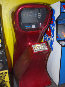
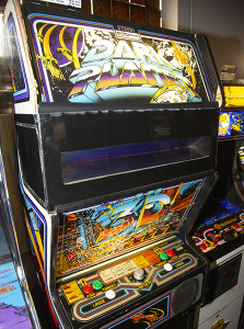
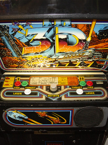
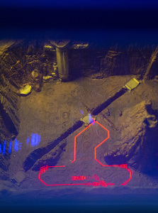
Dark Planet
Dark Planet is quite rare today! Only a small number of units were made to begin with; somewhere around 350 (supposedly production costs were high, which isn't really too surprising for such an elaborate cabinet). Of those, I'm not sure how many are actually still out there. The cabinet and game are quite innovative and in true 3D! The game has an actual physical model for the background and uses filters and two way mirrors to overlay red graphics at ground level and blue graphics floating above. The effect is incredibly stunning in real life and there's really nothing else like it out there. Unfortunately, there was a huge drawback to this technology; for the effect to work, you had to look through a tiny slit in the front of the cabinet. This was annoying if you weren't the right height (tall people would have to lean over and any one too short may have been completely out of luck) and it also meant you couldn't watch someone else playing the game. This limitation is why I left it off the best of list, as it's other wise an incredibly impressive cabinet with great artwork and the 3D effect works beautifully with no 3D glasses. I just wish it wasn't so annoying looking through the tiny window given; but it's absolutely worth an honerable mention!
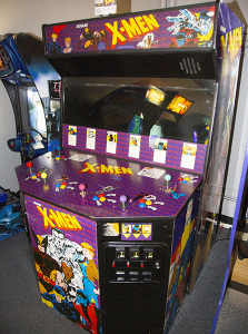
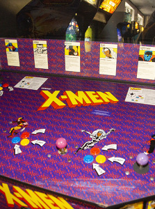
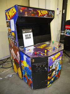
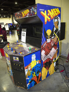
X-Men
The 6-player X-Men cabinet is truly a sight to behold! It's absolutely huge in order to comfortably accomodate 6 players at once along with two monitors for an extra-wide playfield (using a similar technique to that found in Darius). Large cabinets are more common today, but at the time not seen as often; X-Men offered a fun multi-player experience in a cabinet that was both attractive (a little boxy perhaps) and functional. All sides are covered in appropriate X-Men artwork, and the extra width allows for 6 players to fit comfortably, provides a large screen, and some excellent stereo sound. You don't see these very often, probably due to the incredible size and weight (the much smaller 2 and 4 player versions are far more common). I'm not sure what it weighs; looking it up, I've seen varying accounts ranging from 350 to 400 lbs. Whatever the actually weight is, it's without a doubt on the heavier side for an arcade game. Luckily, it breaks into three pieces (the front panel with the controls, the main cabinet, and the second monitor), but it's still a beast to move. However, if you do have an opportunity to try one, definitely do so!
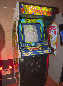
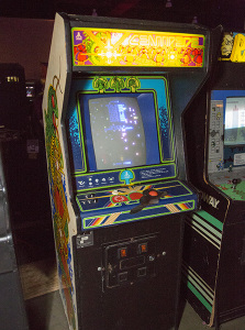
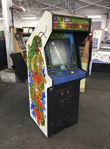
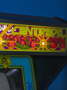
Centipede and other early 1980's Atari cabinets
In the early days Atari had some amazing design sensibilities. With a staff of artists second to none, their industrial design practically defined arcade. Cabinets like those used for Centipede, Dig Dug, Kangaroo, Pole Position, and a whole lot more are perfect examples. Both practical and attractive, Atari cabinets are the epitome of what I think of when envisioning an arcade game. Each of them had wonderful artwork adorning the marquee, control panel, bezel, cabinet sides/front, and everywhere possible. Choosing a singular game is impossible, they all look great. Centipede is my personal favorite, but Dig Dug is a close second. Atari from this era couldn't be beat, which is probably why I had to put that later Gauntlet 2-player cabinet on the worst list (especially a travesty given the 4-player version design). It wasn't just arcade games, the effort Atari put into illustrations for their Atari 2600 and Atari 5200 games was also second to none for the era. Too bad it couldn't last...once late 1983 hit, the great video game crash changed everything.
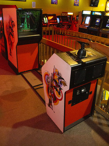
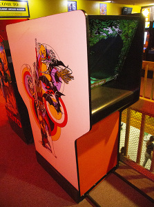
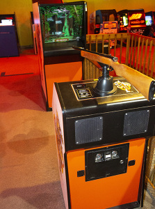
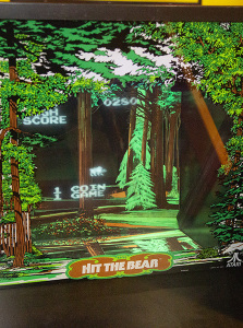
Triple Hunt
Atari again? Yes, we can't get away from them! Back in 1977 they released a now obscure game called Triple Hunt. It actually consisted of three games which could be selected by the operator; you may more likely recognize it as either Hit the Bear, Raccoon Hunt, or Witch Hunt. To change games the operator would need to switch out the artwork (such as the bezel and backdrop) and set a switch on the PCB for the desired game. Regardless of the game, the gameplay was essentially the same; use a rifle to shoot targets for points in a given time limit! What's particularly notable is the array of features for the game. The background sound were actually played off of an 8-track tape so they were not only in stereo but realistic, an unusual feature in an era where simple PSG style sound chips was the best you got normally. It was also particularly long; the cabinet was really two parts, the main cabinet with the monitor, and the control panel with the gun, speakers, and coin box. This provided a much longer distance it appeared you were shooting from than typical gun games, and also made the rifle proportions more realistic. The game is quite rare today; but it's an unusually elaborate contraption so if you do find one give it a try!
The End...For Now
...and that's all for today. It should be noted that these are all the U.S/North American cabinets; versions found elsewhere, especially Japan, could vary and I didn't consider them for this list since I'm less familiar with possibilites (sorry). As a side note, definitely check out the Japanese cabinets for Darius games as they are impressive! I mentioned at the start this list is hardly complete, I didn't even get to some really well done games including Star Wars or SEGA's impressive motion cabinets for OutRun and After Burner. And at the end of the day, from an operators point of view, the cabinet design didn't really matter as long as patrons were parting with their hard earned quarters. But as a player, I always appreciated the attention to detail in presentation, even if that is superfluous to the really important details of gameplay. At some point, I'll hopefully get around to doing another cabinet highlight list like this one including some of those I missed this time as well as a list for games available as conversion kits. These could also vary wildly, not just in how the manufacturers designed the kit but in the care and attention to detail an operator took in actually installing it. That's a story for another day, so until then stay safe, stay healthy, and take care!